Andy Warhol
/Ever since I snapped this image at the exhibit Camp: Notes on Fashion at the Metropolitan Museum of Art in the Summer of 2019 I’ve been thinking of writing about this great American visionary and artist. Since Andy would have celebrated his 95th birthday this past Sunday August 6th I thought this week was the perfect time to share an article about him.
Andy grew up in Pittsburgh, PA. the youngest of four brothers. As a child he suffered from Sydenham Chorea a disease that causes involuntary movements of the extremities. He spent time confined to bed at age 8 and later when speaking about this time said he occupied himself by drawing and listening to the radio; saying this period was very important to his personality development.
I learned through my research Andy won an award Scholastic Art and Writing Award during High School. He attended Carnegie Mellon University in Pittsburgh, where he studied commercial art. While at CMU he joined the Modern Dance Club and Beaux Arts Society. Andy was the art director of the student art magazine: Cano, illustrating a cover in 1948 below: Sprite Heads Playing Violins.
Sprite Heads Playing Violins, 1948
He also illustrated a full-page in 1949 below. These are believed to be his first published art.
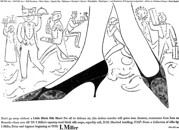
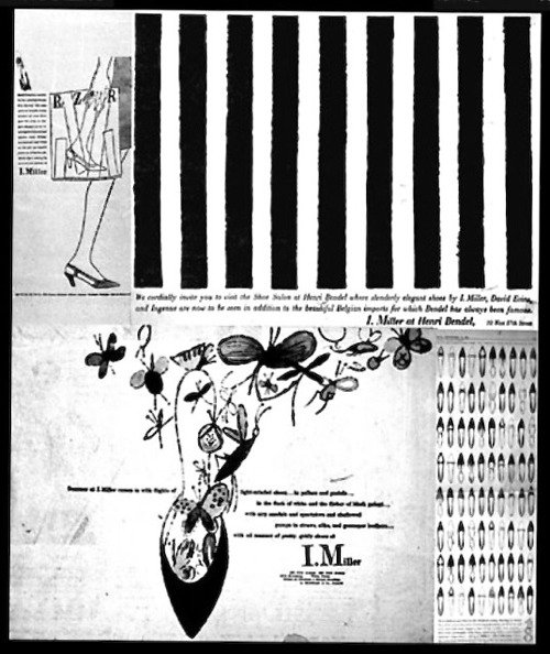
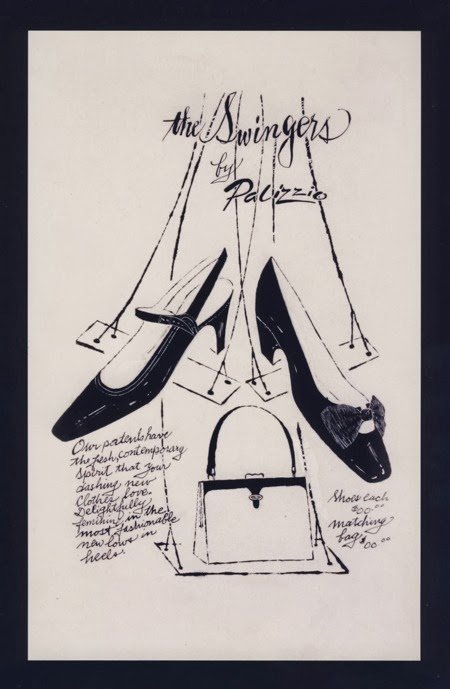
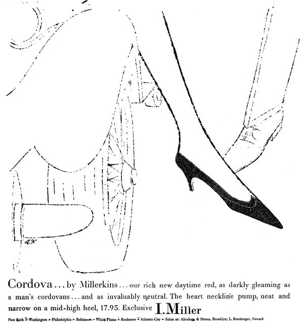
After earning a degree in Pictorial Design in 1949 Andy moved to New York City and began his first career - in magazine illustration and advertising. He drew shoes for Glamour magazine. Andy’s work was well received at Glamour and he was given more and more pages per issue. He was soon working for shoe manufacturer I.Miller. During this time Andy developed his "blotted line" technique, applying ink to paper and then blotting the ink while still wet, which was similar to printmaking. His use of tracing paper and ink allowed him to repeat the basic image and also to create endless variations on a single theme.
Andy had his first solo show at the Hugo Gallery, New York in 1952. In 1956, he was included in his first group exhibition at the Museum of Modern Art, New York. His 1957 his show at the Bodley Gallery, New York included many early ink drawings and some shoe advertisements.
At this time he’s working to pay bills and simultaneously pursuing his art.
By the late 1950’s Andy had started tracing photographs projected with an epidiascope. He used Edward Wallowitch, his boyfriend’s photograph Young Man Smoking a Cigarette (1956) in 1958 for a book jacket design for the Walter Ross novel The Immortal and later used others for a series of paintings.
Andy was hired by RCA Records to design album covers and promotional materials.
In 1962 Andy learned silk screen printmaking and in his book Popism: The Warhol Sixties, Warhol wrote: "When you do something exactly wrong, you always turn up something."
In May 1962, Andy was featured in an article in Time magazine with his painting Big Campbell's Soup Can with Can Opener (Vegetable) (1962). That painting became his first to be shown in a museum when it was exhibited at the Wadsworth Atheneum in Hartford in July 1962. On July 9, 1962, Andy’s exhibition opened at the Ferus Gallery in Los Angeles with Campbell's Soup Cans, marking his West Coast debut. The Gallery, displayed the paintings on shelves running the length of the space, like shelves in a supermarket aisle. “Cans sit on shelves,” Irving Blum one of the gallery owners said later about his installation. “Why not?”
In November 1962, Andy had an exhibition at Eleanor Ward's Stable Gallery in New York. The exhibit included the works Gold Marilyn, eight of the classic "Marilyn" series also named "Flavor Marilyns", Marilyn Diptych, 100 Soup Cans, 100 Coke Bottles, and 100 Dollar Bills. Gold Marilyn, was bought by the architect Philip Johnson and donated to the Museum of Modern Art. At the exhibit, Warhol met poet John Giorno, who would star in Warhol's first film, Sleep (1964).
In early 1963, Andy rented his first studio, an old firehouse at 159 East 87th Street. There he created his Elvis series, which included Eight Elvises (1963) and Triple Elvis (1963). These portraits along with a series of Elizabeth Taylor portraits were shown at his second exhibition at the Ferus Gallery in Los Angeles. Later that year, Warhol relocated his studio to East 47th Street, which would turn into The Factory. The Factory became a popular gathering spot for a wide range of artists, celebrities, musicians and writers.
In the spring of 1964 Andy had his second exhibition at the Stable Gallery featuring sculptures. The pieces were wooden boxes with silk-screened graphics consisting of Brillo Box, Del Monte Peach Box, Heinz Tomato Ketchup Box, Kellogg's Cornflakes Box, Campbell's Tomato Juice Box, and Mott's Apple Juice Box. They were stalked and scattered like a warehouse.
A pivotal event was The American Supermarket exhibition at Paul Bianchini's Upper East Side gallery in the fall of 1964. The show presented as a typical supermarket with everything in it created by pop artists. Andy designed a $12 paper shopping bag - plain white with a red Campbell's soup can. His painting of a can of a Campbell's soup cost $1,500 while each autographed can sold for 3 for $18, $6.50 each. The exhibit was one of the first events that shared pop art with the public and asked the question what is art.
As an advertisement illustrator Andy has used assistants and this continued in the 1960’s. Gerard Malanga assisted Andy with silkscreens, films, sculpture, and other works at The Factory. He also had a group of individuals whom he entitled “superstars” that worked with him on various projects at The Factory including his films.
In 1967 Andy established Factory Additions for his printmaking and publishing enterprise.
On June 3, 1968, radical feminist writer Valerie Solanas shot Andy and Mario Amaya at The Factory. On the day of the shooting she’d been at The Factory and asked for the return of a script she’d given to Andy. The script could not be located. Solanas had been a marginal figure in the Factory scene. In 1967 she wrote the SCUM Manifesto, a separatist feminist tract that advocated the elimination of men; and appeared in the 1968 Warhol film I,a Man.
Unlike Amaya who had minor injuries and was released from the hospital the same day; Andy was seriously wounded by the attack and barely survived. Two bullets from Solanas’ gun tore through his stomach, liver, spleen, esophagus and both lungs. He was briefly declared dead at one point, but doctors were able to revive him. He spent two months in the hospital recuperating from various surgeries and would be forced to wear a surgical corset for the rest of his life to hold his organs in place.
The shooting had a major impact on his life and work, even beyond the considerable physical scars. He became more guarded and focused on business. In 1969, Andy and John Wilcock founded Interview magazine.
Many feel the shooting contributed to Andy’s early death at age 58. Andy’s intense fear of hospitals led him to delay having gallbladder surgery for years. When Dr. Thorbjarnarson finally operated on February 21 the surgeon found a gallbladder full of gangrene; the organ fell to pieces as he removed it. Andy was also dehydrated and emaciated from having barely eaten in the previous month. Post operation Andy was in his room making calls that evening. He was fine at 4am when his private nurse checked on him. Two hours later he was unresponsive and resuscitation efforts failed. He died of cardiac arrest February 22, 1987.
Warhol had this to say about the attack:
“Before I was shot, I always thought that I was more half-there than all-there—I always suspected that I was watching TV instead of living life. People sometimes say that the way things happen in movies is unreal, but actually it's the way things happen in life that's unreal. The movies make emotions look so strong and real, whereas when things really do happen to you, it's like watching television—you don't feel anything. Right when I was being shot and ever since, I knew that I was watching television. The channels switch, but it's all television.”
In 1971 there was a retrospective of his work at the Whitney Museum of American Art. In 1973 he created his portrait of Chinese Communist leader Mao Zedong. In 1975, he published The Philosophy of Andy Warhol. An idea expressed in the book: "Making money is art, and working is art and good business is the best art."
Andy was often at nightclubs in NYC spending a lot of time at Studio 54. In 1977, Warhol was commissioned by art collector Richard Weisman to create Athletes, ten portraits of the leading athletes of the day.
Athletes Series, 1977
Andy dedicated time to finding patrons for portrait commissions including Brigitte Bardot, Mick Jagger, John Lennon, Liza Minnelli, the Shah of Iran Mohammad Reza Pahlavi, his wife Empress Farah Pahlavi, his sister Princess Ashraf Pahlavi and Diana Ross. Reviewers were not kind to his exhibit of portraits calling them superficial and commercial with no depth. In 1979, Andy and longtime friend Stuart Pivar founded the New York Academy of Art.
In the 1980’s Andy gained critical and financial success; partially due to his ventures with younger artists. Jean-Michel Basquiat, Julian Schnabel, David Salle. Andy also earned street credibility when graffiti artist Fab Five Freddy paid homage by painting an entire train with Campbell soup cans. But, there was still criticism that Andy was becoming a business artist. Critics panned his 1980 exhibition Ten Portraits of Jews of the Twentieth Century at the Jewish Museum in Manhattan. In hindsight, however, some critics have come to view Andy’s commerciality as "the most brilliant mirror of our times.”
Andy had an appreciation for Hollywood glamour. He once said: "I love Los Angeles. I love Hollywood. They're so beautiful. Everything's plastic, but I love plastic. I want to be plastic.” Andy occasionally walked the fashion runways and did product endorsements, represented by Zoli Agency and later Ford Models.
from Andy’s Look Book
In 1983 Andy teamed with 15 other artists including David Hockney and Cy Twombly, and contributed a Speed Skater print. The Speed Skater was used for the official 1984 Sarajevo Winter Olympics poster.
In 1984, Andy created Orange Prince (1984) when he was commissioned by Vanity Fair Magazine for a portrait to be included in an upcoming article about the musician Prince.
In September 1985, Andy’s exhibition with Jean-Michel Basquiat: Paintings opened to negative reviews at the Tony Shafrazi Gallery.
Despite Andy’s apprehension later that same month his silkscreen series: Reigning Queens was shown at the Leo Castelli Gallery. The subjects of the 16 pieces were Queen Elizabeth II, Queen Beatrix of the Netherlands, Queen Ntfombi Twala of Swaziland and Queen Margrethe II of Denmark. In the Andy Warhol Diaries, Andy wrote, "They were supposed to be only for Europe—nobody here cares about royalty and it'll be another bad review."
Andy Warhol's Fifteen Minutes aired on MTV from 1985 to 1987. The five episodes exposed Andy to a whole new audience. I remember watching it.
In January 1987, Andy traveled to Milan for the opening of his last exhibition, Last Supper, at the Palazzo delle Stelline.
On February 17, 1987 Andy and jazz musician Miles Davis modeled at the Koshin Satoh's fashion show at the Tunnel in New York City in a mere 5 days Andy would be dead.
“Someone said that Andy was a skyscraper and when he died the skyline of New York changed,” said Yoko Ono, who described Warhol as the “mentor” of her fatherless son, Sean Lennon. “But it hasn’t changed. Andy is still with us and he will always be.”
I own a print of So Meow. I need to find the perfect stop for it in the Chalet!
I thoroughly enjoyed learning more about Andy Warhol and I hope you did too! Watch THE Andy Warhol DIARIES on Netflix if you haven’t.
Til next time be well and I’ll see you over on Instagram.

