Artistic Artery

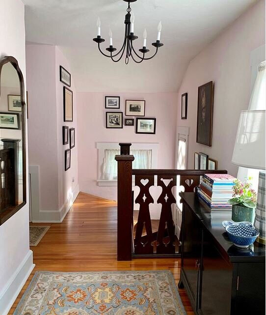
I’m SO very happy with the design changes we made to the Chalet Hall.

JVPUE2714 (1).JPG

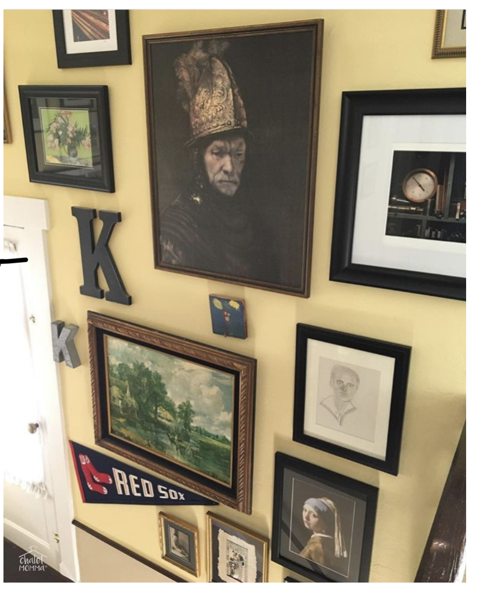
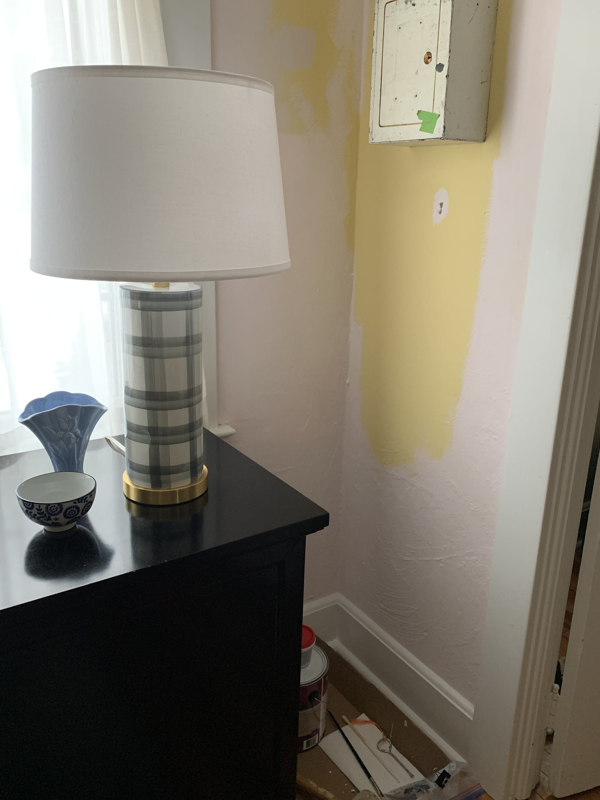
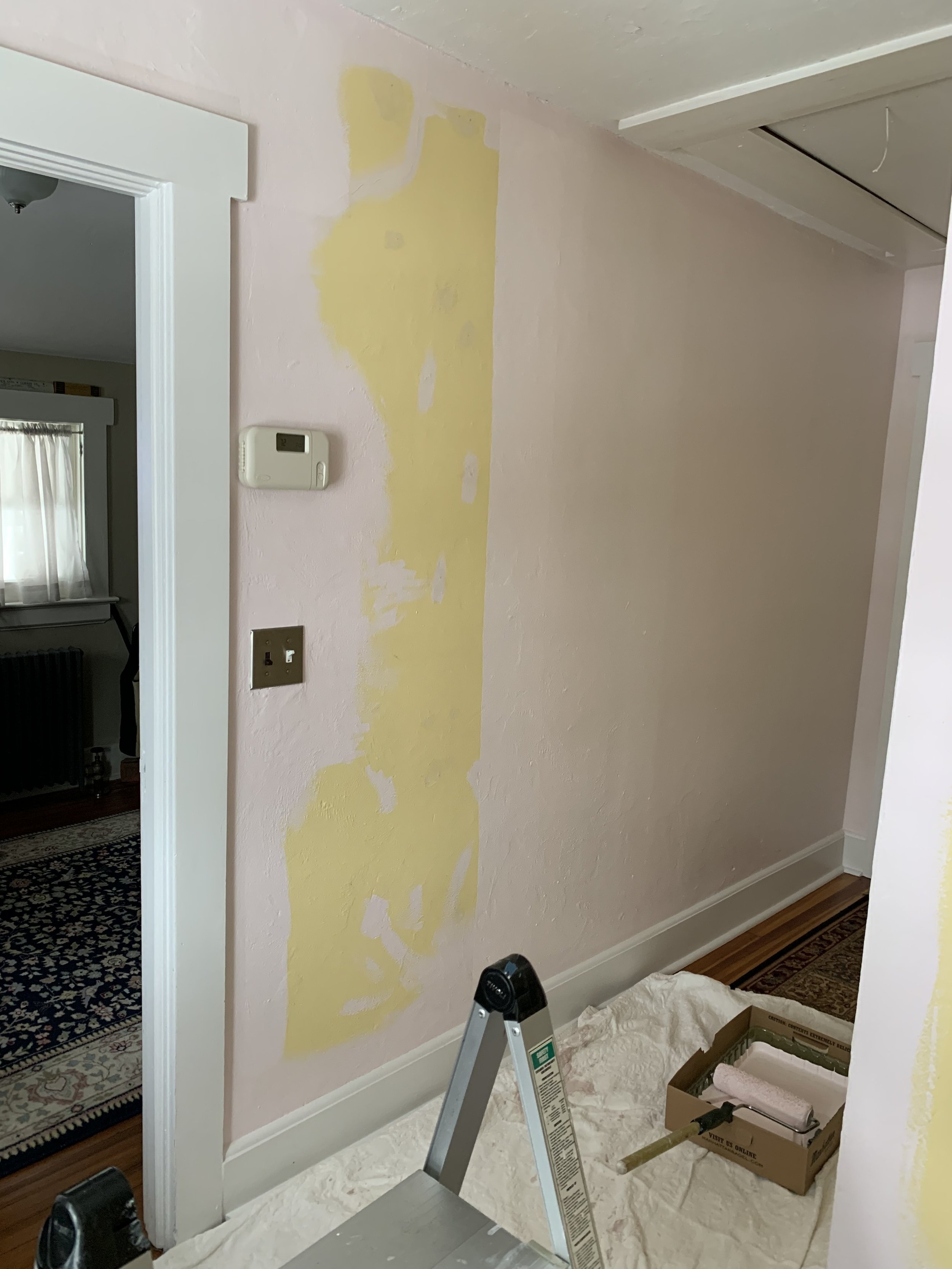
Let’s remember what the space looked like… We enjoyed the Benjamin Moore Hawthorn Yellow for 10 years but, it was time for a change.

IMG_5715.jpg

Everyone who views this understands why my signature tag on IG is SayNoToEmptyWalls and my second IG feed bears that same handle @saynotoemptywalls.

IMG_6141.jpg
full wall of art.JPG

Pink was first used as a color name in the late 17th century. It is the color most often associated with charm, politeness, sensitivity, tenderness, sweetness, childhood, femininity and romance.

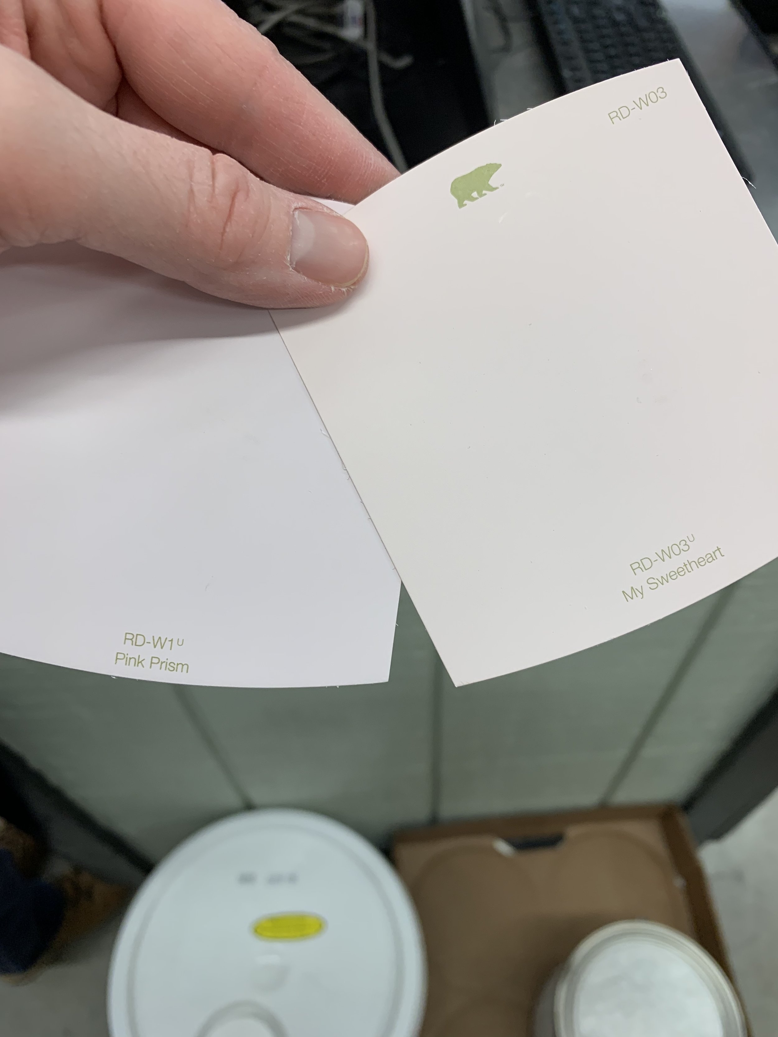
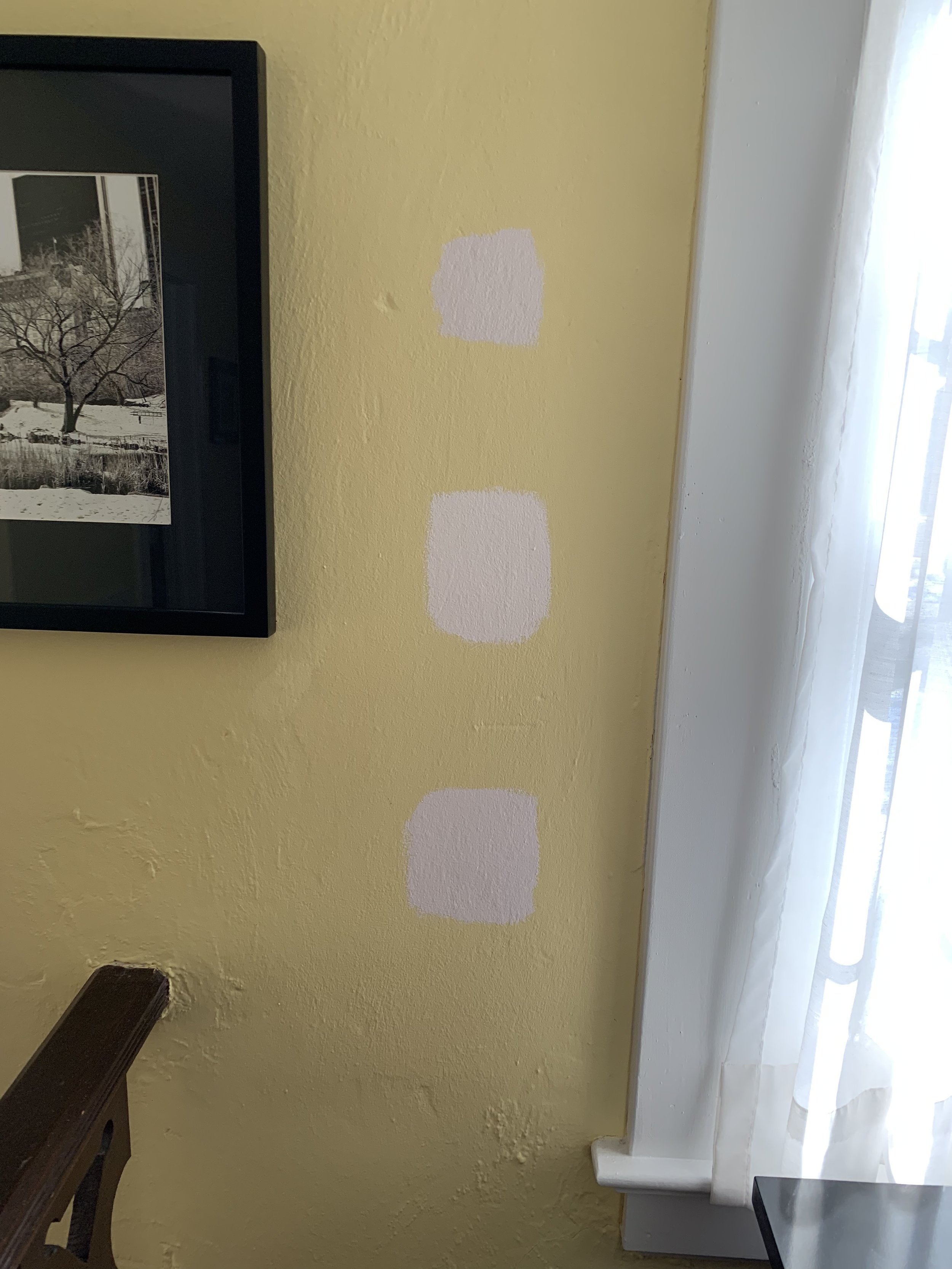
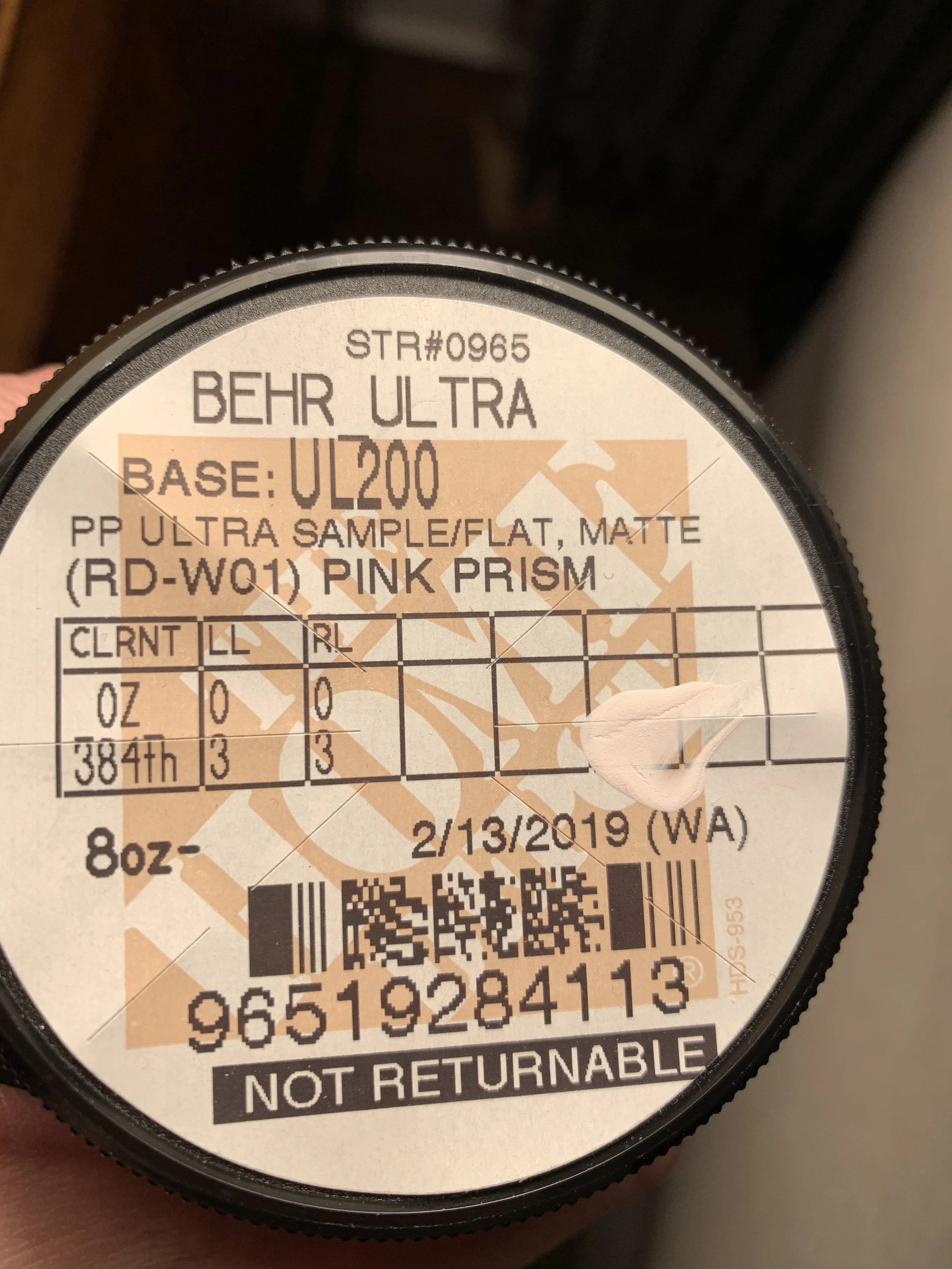
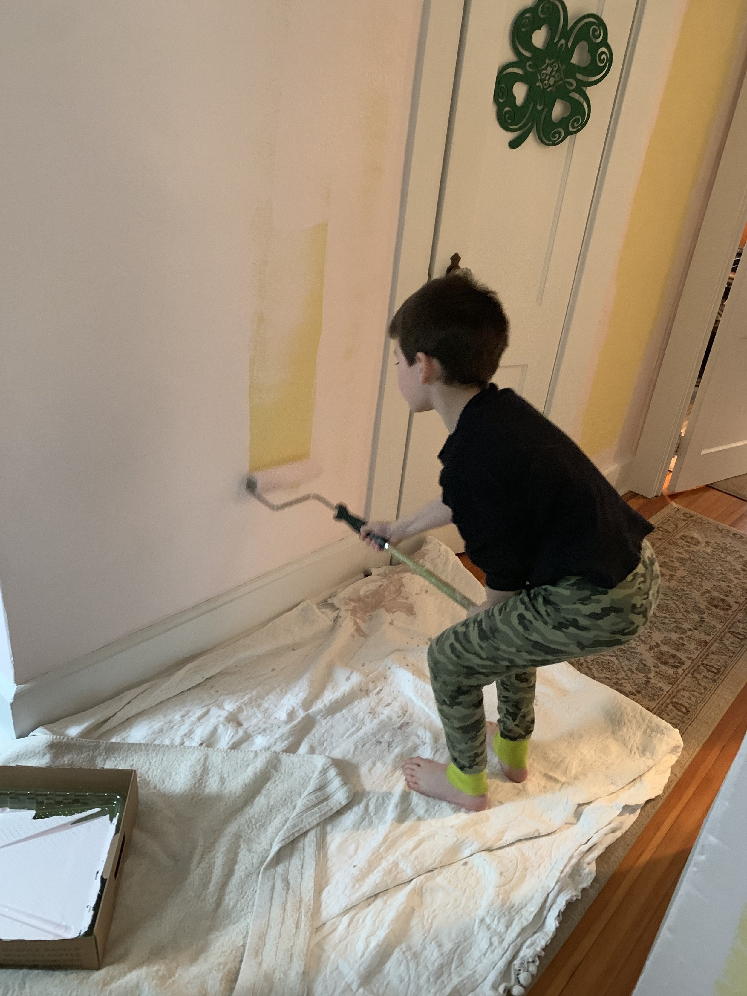
Although this was my project everyone got involved. Liam helped from the first trip to Home Depot for swatches to the final paint purchase Pink Prism and you can see he even did a bit of painting! After I spent two weeks cutting in around all the windows and many doors - Steven took pity on me and rolled the paint.

IMG_8792.jpg

This lovely Egyptian Lady was the first piece I rehung. If you don’t think light plays with wall color… just look - it reads as two different shades. From here I moved around the space towards the stairs - rehanging the local history images and for the main stair wall I decided on a portrait gallery.

IMG_7186.jpg
IMG_7188.jpg

I was restrained as I worked my way around. I was determined to have it be purposeful and not hodgepodge. The Man With The Golden Helmet - a copy on canvas of the Rembrandt is always a focal point and he went right back on the same nail he was hung on before.

IMG_6480.JPG

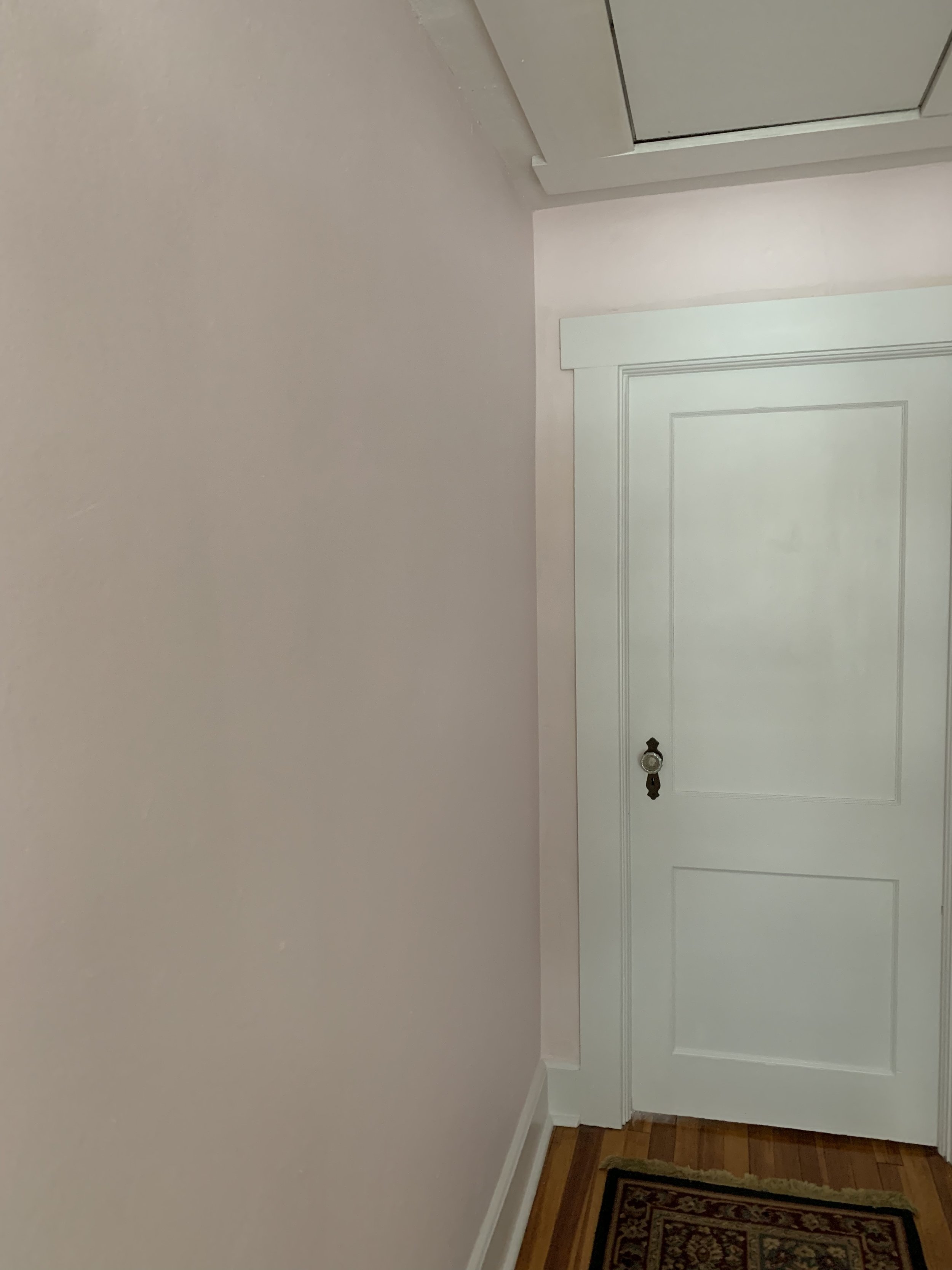
If you’re not familiar with the Chalet’s architecture - we have a center chimney which means we have two hallways upstairs around that chimney. The first has entrances to the bath, linen closet and L’s room - and here on this side we have this hall to the master. I left this space blank for a few weeks. I mean come on .. I am sooo in love with this color and I also needed to give myself time to map out the installation.

IMG_7595.jpg

I knew this fine lady Camille (Camille Doncieux (1847 - 1879) the first wife of Claude Monet and the subject of - La Japonaise (Camille Monet in Japanese Costume) 1876, was coming out of storage to be placed in the center and that everything would radiate from her. - The original work is on display in Lorna and Robert Rosenberg Gallery #252 in the Museum of Fine Arts Boston. A dear friend was there recently and sent me a picture of the original. (thanks so much Alison!)

IMG_7649.jpg

Again, I was taking my time - Mrs. Monet sat here alone for well over a week… I had to feel what it would be. It had to evolve. I didn’t want to rush the process and be unhappy in the end.

IMG_7656.jpg
IMG_7655.jpg
IMG_7812.jpg

I LOVE how it turned out. What seemed like such a large area was quickly filled but, I’ve managed to squeeze in 2 small pieces since this image was taken.

IEFR3313.JPG
please follow along....PNG

Til next time - go grab a hammer and hang up some art or paint a space something unexpected!

Gold Heart Meryl.png

Design Shift

Over the last few months I have made some design changes to the Chalet Livingroom - today I want to talk about the process.

mgk livingroom.png
console table

console table

Let’s start at the beginning… back in July I was lamenting… I didn’t like my livingroom… wah wah…

Should I swap the console table for the cabinet in the upstairs hall? I didn’t like my couch and for that matter I didn’t like the coffee table either… wah!

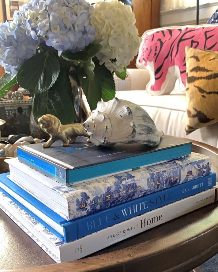
I stopped dead and decided to pull everything off the console table and restyle - which I did… and viola! Once lightened up with less - I was in love again! Removing frames and books made a huge difference!

2018-08-23+22.30_edited.jpg

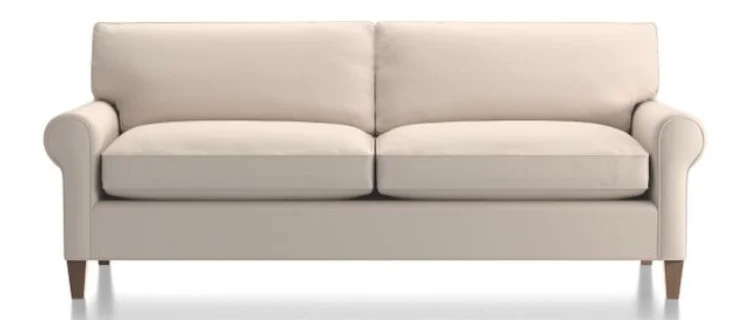
Then I decided I needed to a new couch - if you read my piece from 11/14/2018 Couch - furniture for sitting or reclining. I went to Crate and Barrel and placed an order for the Montclair Sofa - Traxx fabric in Feather - it would be delivered in October. I kept looking around the room going piece by piece… what else could I change?

homesense sharing my image.png

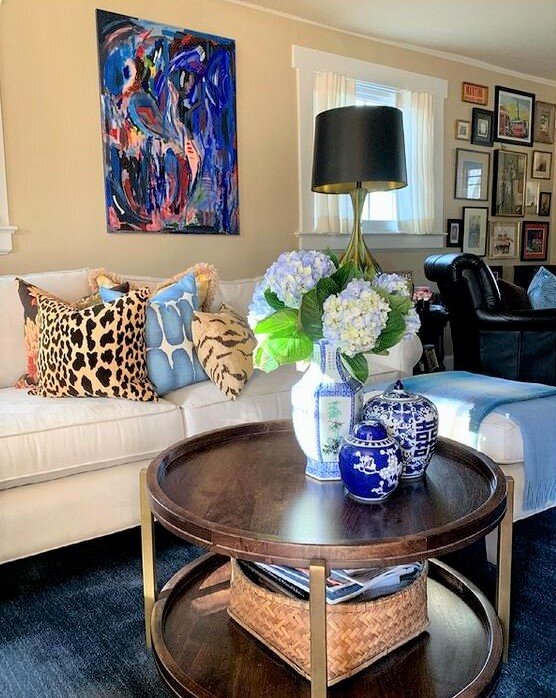
Next up was a coffee table…. while I still love my bench… the rustic finishes were no longer where I wanted the livingroom to be… So I made my way to one of my very favorite retailers Home Sense. In my minds eye I knew what I wanted… and tho and behold it is exactly what I found… round and two tier! I am in love my friends and the brass accents on the legs are the crowning jewel!

top of tv cabinet.JPG

The next bit I tackled was the top of the television cabinet…. I put away a lot of decor.

IMG_3965.jpg
IMG_3683-1.jpg

I love how the top of the China Cabinet is styled. For some reason I had always resisted symmetry - I love my new Home Sense lamps! I was inspired by interior designer and friend Diane Rath - she actually picked up these very same lamps up for a client. Diane is someone I’ve seen use pairs of lamps successfully in her designs. I’m loving the deer art here too - I had never leaned art on a cabinet before… on the floor on the mantel on window sills Yes but never when wall space was available. I grabbed this image prior to moving the Art that was hidden behind the lamp.

I reworked the sideboard as I was de-christmasing the chalet. I wanted to get a lighter brighter look in this area, but, before I went out and shopped for something new - I shopped my house. Moving this cloisonne lamp from the upstairs hall really made the area pop - especially since the lamp shade is white. I also took down a piece of artwork.

IMG_3960.jpg

When we put the Chinese Cabinet back in the corner after Christmas I realized it needed a change too - and that change is this new lamp! I love the pop of white in this corner and yes it’s another Home Sense find! I can’t say it enough whenever I seek I always find it at Home Sense!

Snapseed-1.jpg

You can see in the above image I also organized the decor on my roll-top desk.

I love the new look of the chalet - it’s definitely more streamlined. This is where I’m headed with my design as we enter 2019. My former funky cacophony of crap decor style was adding to a sense of chaos. In general I am moving away from the look I liked for the last decade… it’s funny how things change and yet they circle back around; 20 years ago I decorated in a traditional vain and then I morphed into a more rustic look and now while I do wish to maintain an air of casual usability I want the Chalet to be pulled together.

Traditional Casual with a touch of Chinoiserie is the new description of the Chalet!

please follow along....PNG

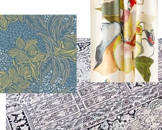
Next week I’ll be sharing the Images that are inspiring my thoughts for new floor coverings!

Til next time!

Gold Heart Meryl.png