Design Inspiration

Today I’m sharing some inspiring images.

IMG_9505.JPG

I snapped this image at a Decorator Show House 3 years ago and it’s been on my phone ever since.

A little piece of art in a bookshelf. Holy Moly friends I’m in heaven.

Diane The Rath Project .png

Everything about this entryway in my friend Diane Rath’s home is stunning! @therathproject

103303695_w_0.jpg

The bold pops of black in the neutral setting of Michelle Adams livingroom make me seriously happy! This is a room I want to live in! And Rufus is pretty cute too! @michelle_adams_

RitaKonig .png

Rita Konig’s eye for detail is delightful. I love all the bits on her mantel. @ritakonig

llaayyeerrss .png

Gal pal Tiina Treasure’s apartment pulls me in - I want to sit, poke around her stuff, get comfy and drink wine. @llaayyeerrss

Au Petit Salon Design .png

My sweet friend Ginny Stalker is always switching things up in her lovely barn. There is always new fun things to enchant your eye! @aupetitsalondesign

hayley mumslittleloves.JPG 2.png

Hayley’s home is indigo dreamy! @mumlittleloves

Sarah The Grand Apt.png

Sarah Jacobson’s brick wall is enough to make anyone swoon but, then she’s layered her space with focused design that tells a wonderful story and I adore it - ALL! @thegrandapt

The Happy Cocoon .png

Brought to you by thrifting… that’s my friend Morgan’s tag line…her home tells such a precious story. @thehappycocoon

Maryn Editorial .png

Here’s another image I’ve had on my phone since Michelle Adams took over @thenest in July 2017. @michelle_adams_

jane at home for email.JPG

There are more words than simply blue to describe the brilliant accents in dear friend Jane’s home. She has navy, azure, cerulean, sapphire and it’s all gorgeous! @jane_athome

nicole for peice.JPG

I am a huge fan of the home my friend Nicole has created in her Manhattan high-rise. I love her design choices and her style which is modern with a touch of boho is so fun! @sweet_domicile

elizabth bear designs.JPG

Elizabeth Bear is a talented designer and friend! I’m especially fond of her family room, the built-ins and all the wonderful art she has curated makes her space so distinct! @elizabethbeardesigns

bev and jeff bedroom.jpg

Now my friend Bev Wilson has an eye for minimalist style with classical touches.

No one but Bev would pair a pine dresser (with custom knobs of course) with this amazing gold framed oil painting and simple light fixture. @roomsauce

bev and jeff livingroom.jpg

Bev’s livingrooom epitomizes her striking style - the furnishings, the gallery wall, the plants! @roomsauce

Who Inspires You .png
please follow along....PNG

Til next time.

Gold Heart Meryl 2.png

liam's lair

my son's room got an overhaul. this change was precipitated by the removal of french doors. now, if you are new to the chalet here are some details - we have 8 doors and until this remodel we had 5 sets of french doors. built in 1924  the chalet was a summer get away - tons of doors and windows for breezes and nary a bit of insulation. (hand hitting head emoji anyway after the galerie to porch switcheroo the door removal was the next big item on my husband's never ending #ToDoList for this 94 year old gem!

view wm.jpg


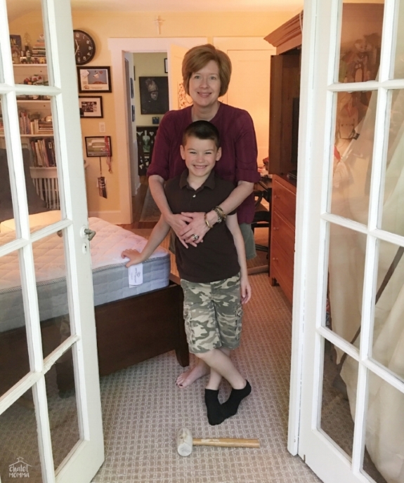
project morning: Steven snapped this of Liam and I as we headed out to a friends birthday party - leaving him on the balcony 3 stories up - happily working in solitude.

this is the view from the bedroom. it was always nerve-racking having an old set of glass doors in a childs room. 

IMG_7108 wm.jpg


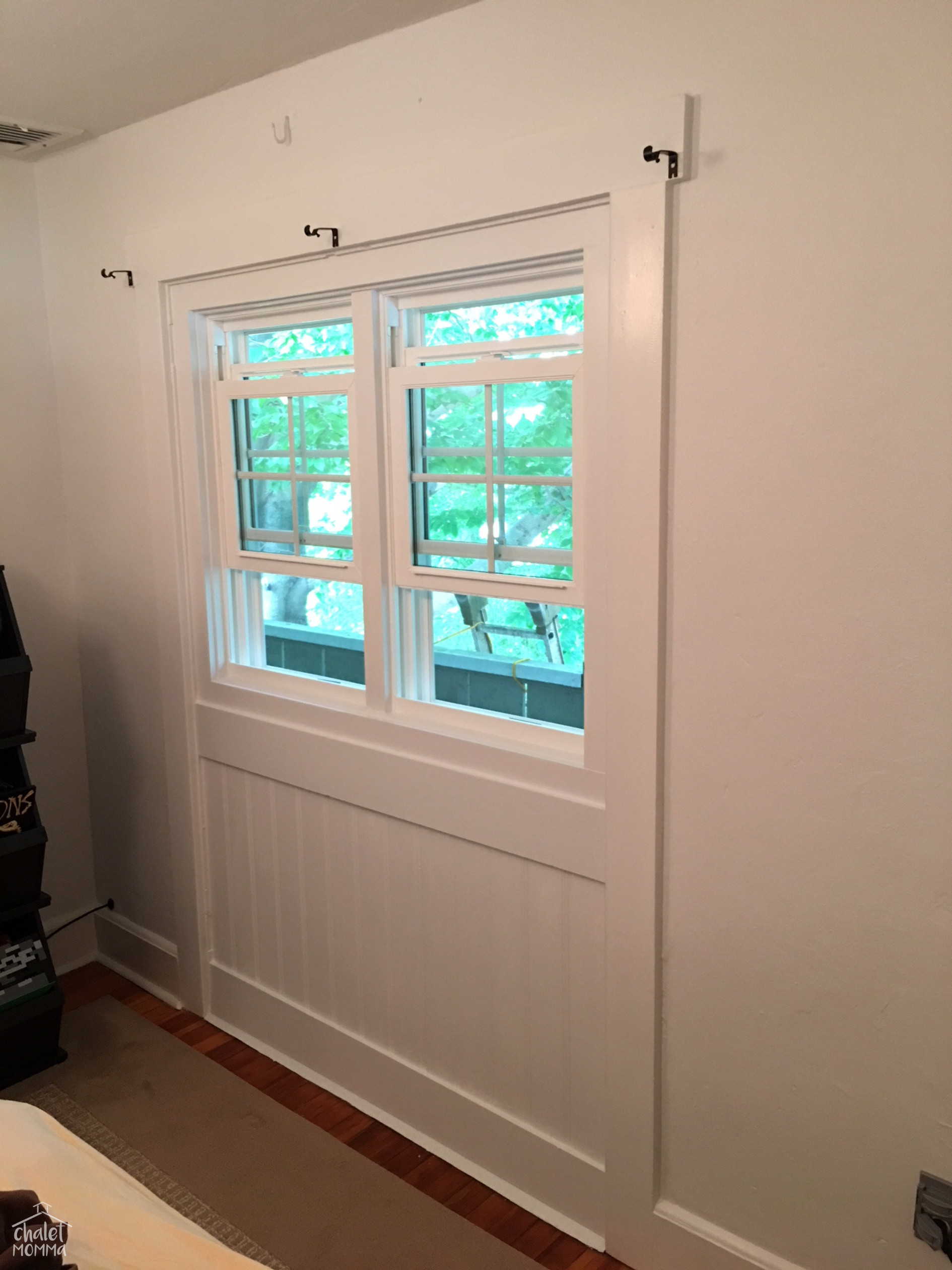
here it is -  a nutshell from the day. Steven's first hurdle the storm doors he caulked shut so well it took him 2 hours to get them open. after that the process was a repeat of the porch - build the wall and install the windows.


he actually finished the outside this past weekend.


we looked for a while for paint - we considered a bunch of dark and light blues and greys, but with how dark our bedrooms are in the chalet due to the wide eaves we decided white was really the best option.


i wasn't prepared for how much i would love the crispness. i quickly realized i wanted to go more navy with some pops of green in the design. hey - my designs are never set in stone. there were plenty of items that were returned to stores; a lamp, rug and other accessories. i washed and put his orange quilt away. i think i will get a navy one when the weather changes but, for now, Liam loves his blue blanket.

finished with all the blue 8 wm.jpg

moving his bed to the other side of the room has made it feel larger. we always had an extra plug in radiator in that outside corner - when the weather changes in October i'm not sure where it will go but, we'll figure it out.

art wm.jpg


all the art we took down did not go back up. i moved a few pieces to the basement - some into storage and we hung one in the play area.


skeleton art cropped wm.jpg

for the first time in my life i am going to let this space and these walls evolve!


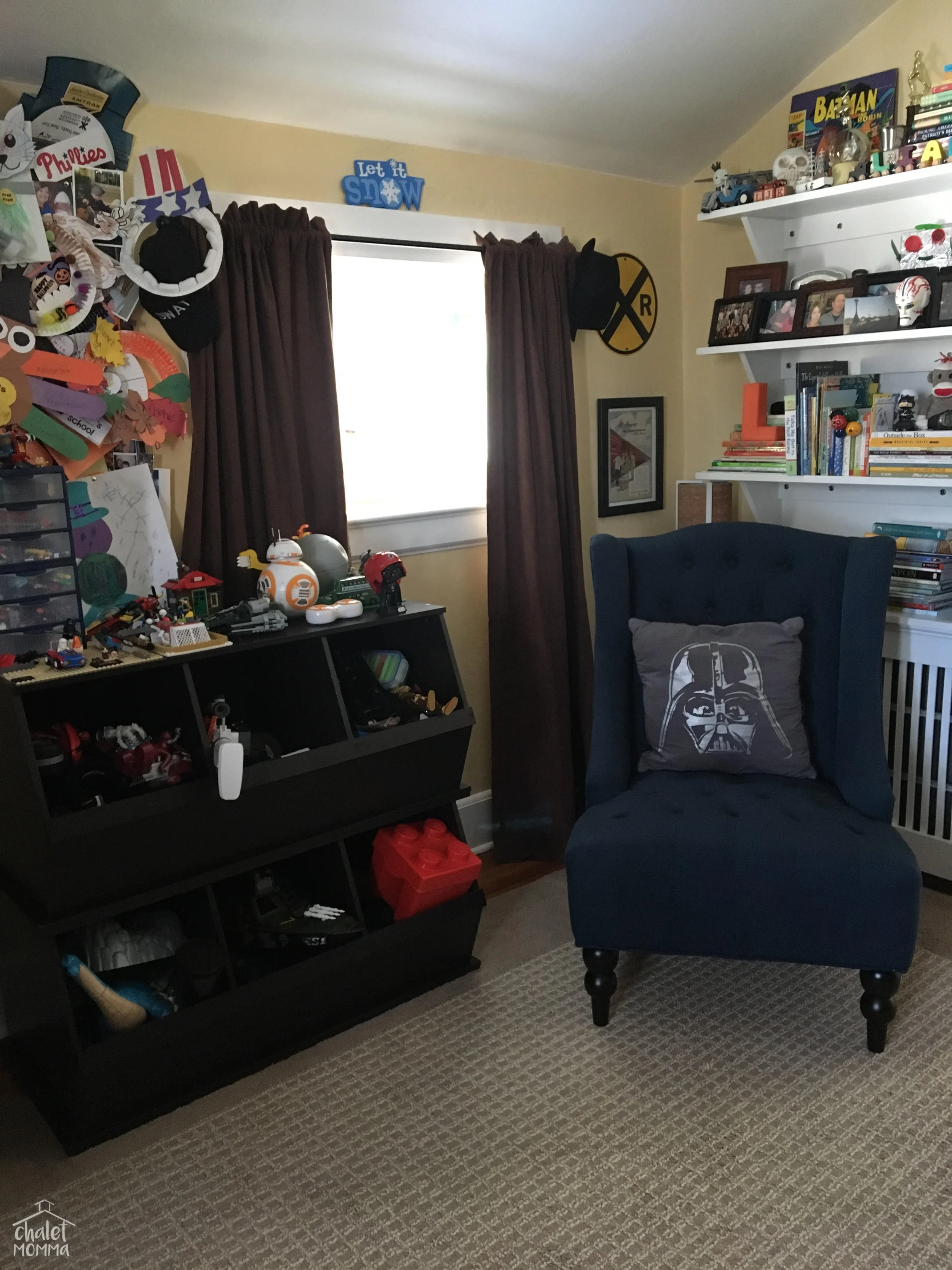
i rehung the skeleton over the storage cubbies. i love these units they hold toys, books and display Legos on top!

star wars poster wm.jpg

i was thrilled he let me frame his Star Wars poster! there was talk of scotch tape on his walls.

IMG_6490 wm.jpg


i am in love love love with the navy leather tray with cross stitching details i found at Home Sense.


how stylish is his lamp? this is one of a set of vintage gold tone lamps that were in my Aunt's living room. some spray paint and voila! 

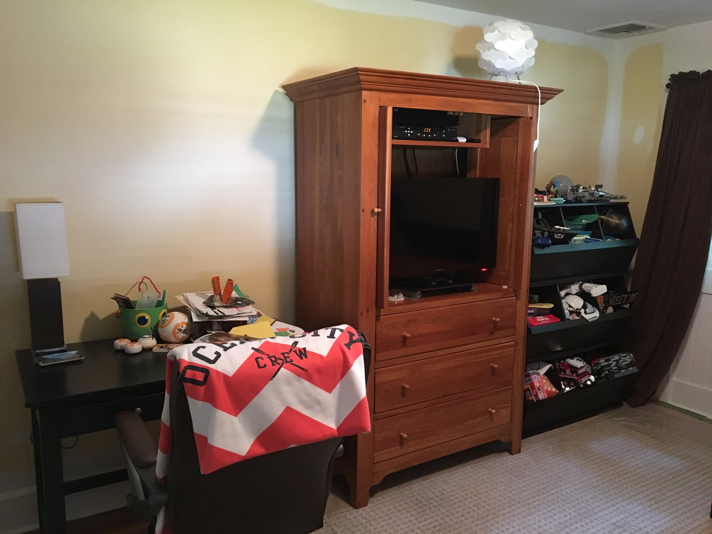
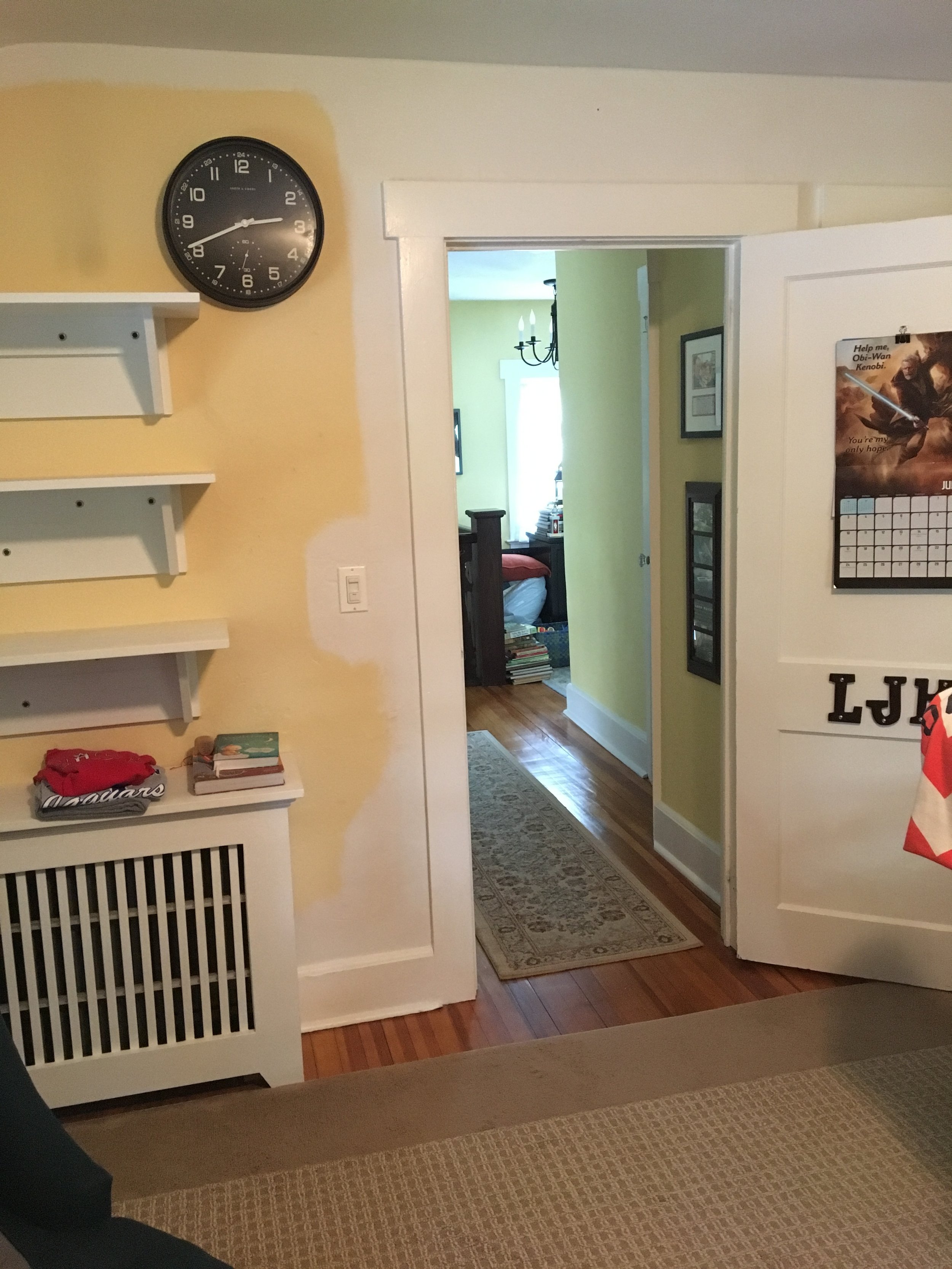
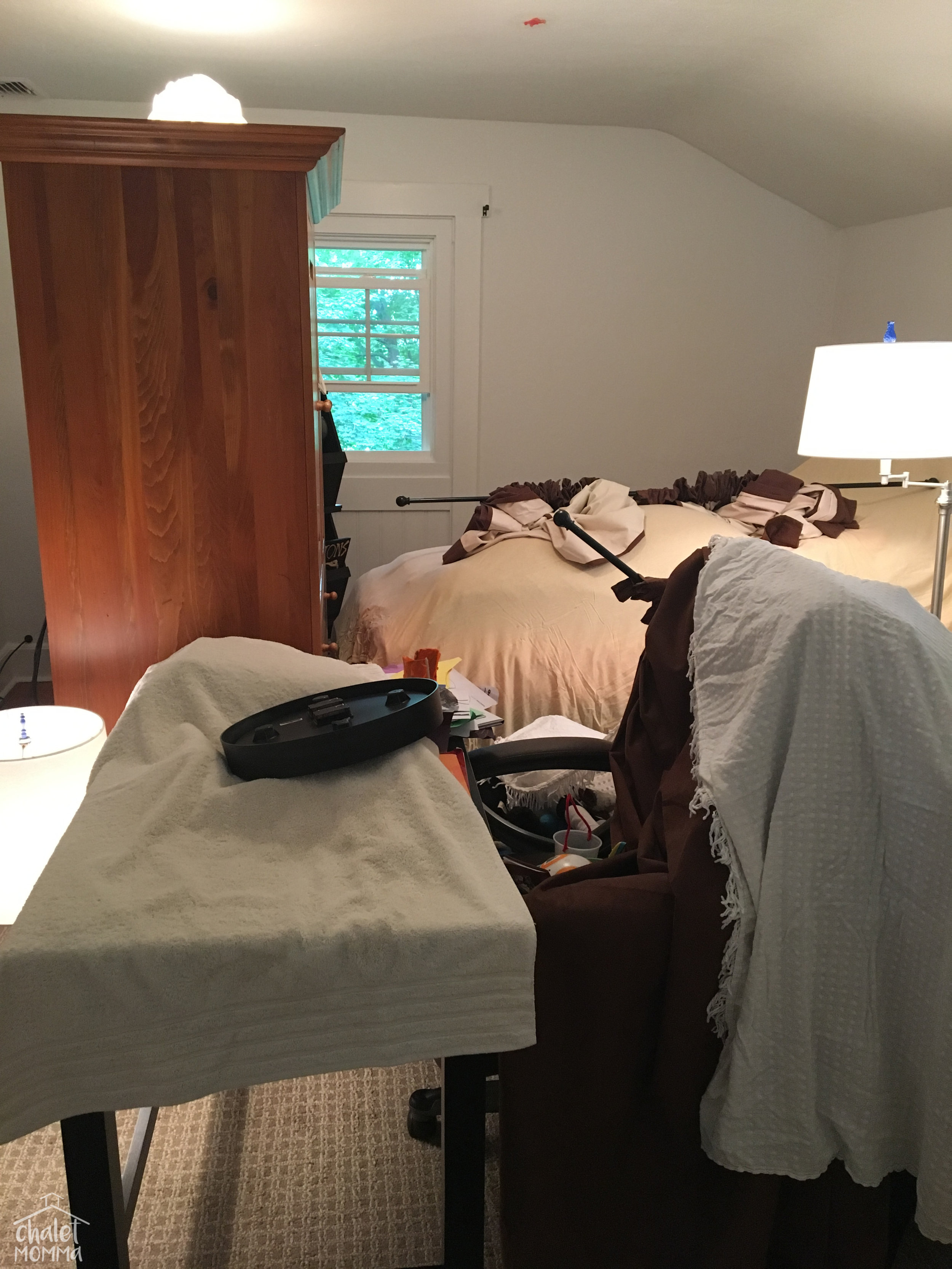
here's a few images of the painting process.

IMG_6701-1 wm.JPG
old image of L's old room design wm.jpg


above is the fresh updated corner and here the same space last winter.


ls room 2014 wm.jpg


this image at left is from 2014. his bed in it's original place.


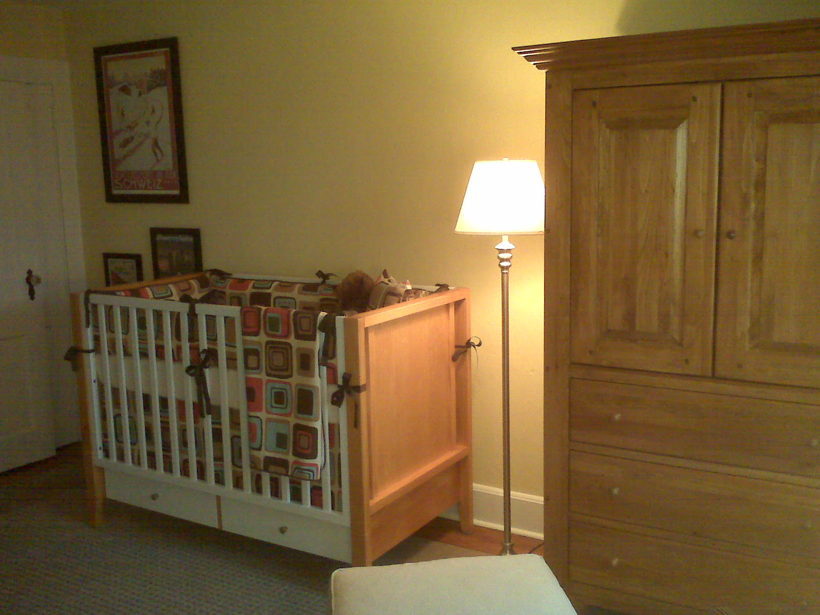
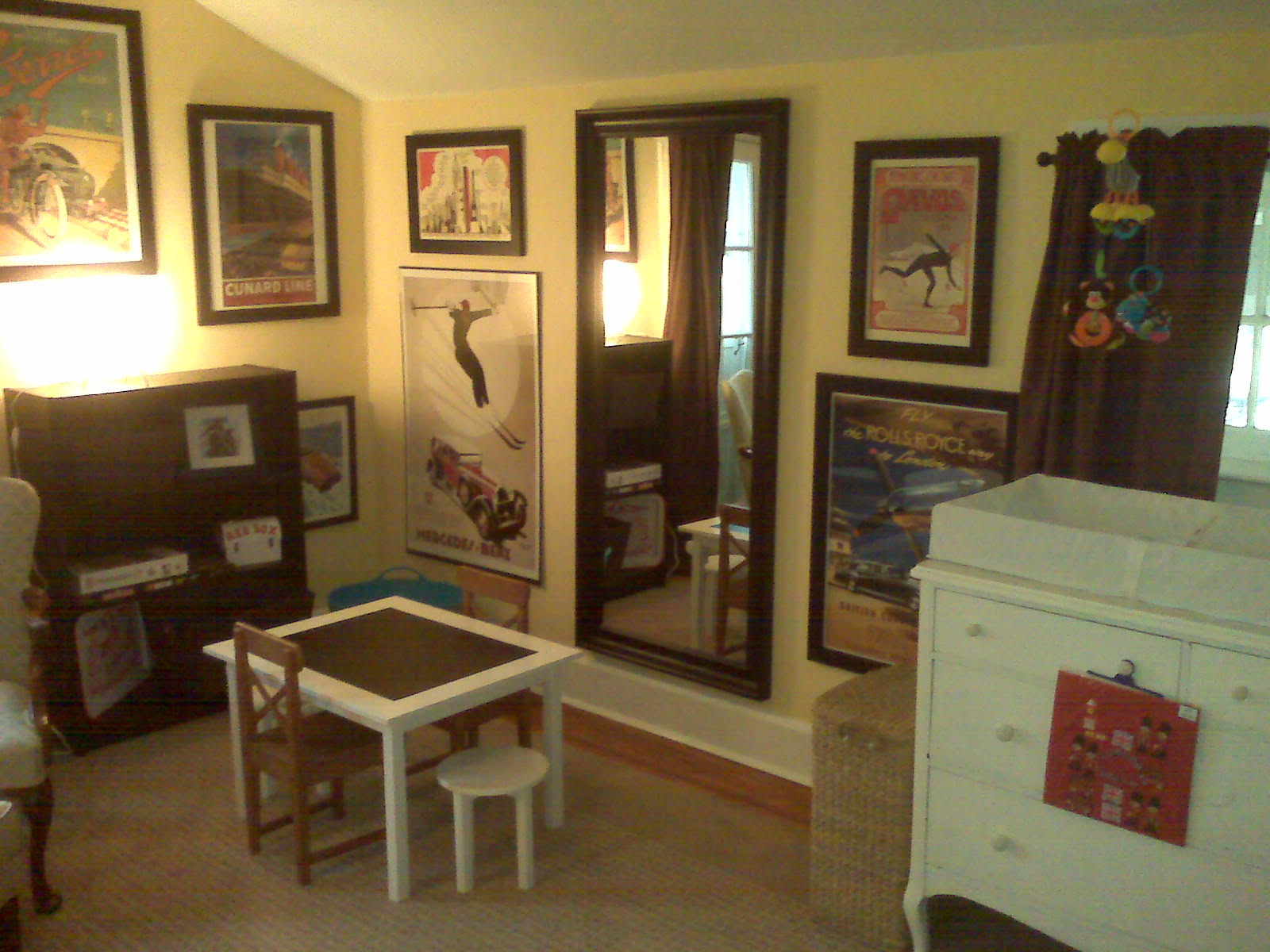
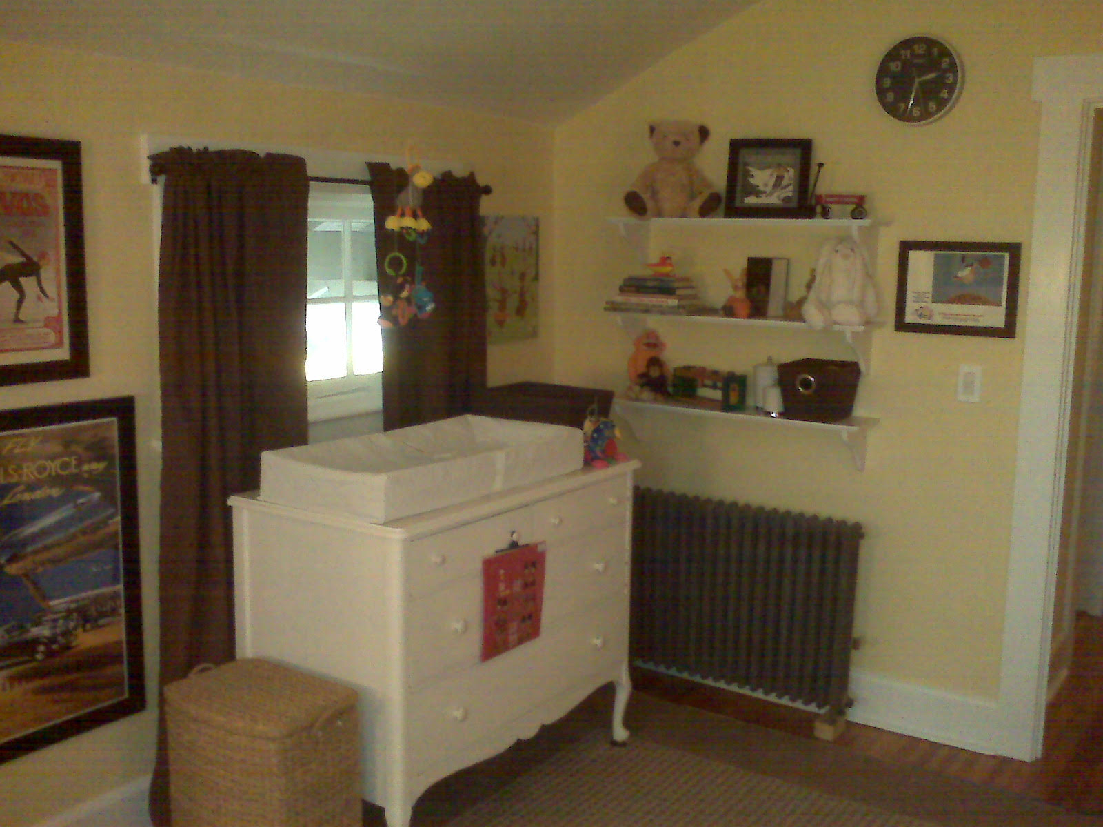
and finally i thought i'd share my original design of Liam's room from when i was pregnant. i never wanted anything cutesy. i found the bedding - i still think the modern square design is timeless. the rug is from Home Depot. we received gifted furnishings, my old dresser was converted into a changing table and the crib was bought sight unseen from Target.com. my biggest splurge was the art from Art.com and framing.

please follow along....PNG

i'm hoping this redo will carry our son through a couple of years. we know he could use a larger bed - he's tall and he's only getting bigger! he's 4 ft 5-1/2 inches tall and 70 lbs. i do already have a scheme in my head complete with a loveseat and trunk coffee table - because he must have the most comfortable place to hang.

til next time.

Gold Heart Meryl 2.png